Thursday, August 31, 2006
Moonpowder-the arrival
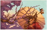
Well, here is my last post for August. This is a painting I just finished for my picture book "Moonpowder".
Only 18 paintings to go! I am hoping to finish it by the end of the year, and I will continue to post the paintings as I complete them.
I also saw that Jon Muth will be speaking at Books of Wonder on Thursday September 7th from 4-6. I am hoping to go to that. I am a big fan of his work. If you don't know his work, he is a former graphic novelist who does amazing watercolors. He has created some beautiful picture books including; Come On Rain, Stone Soup, The Three Questions, and Zen Shorts. He will be signing his new book, wherein he illustrated poems edited by Caroline Kennedy.
Monday, August 28, 2006
Moonpowder-inside factory
Here is the latest painting for my picture book, "Moonpowder". After meeting with my editor and art director at Hyperion, we have decided to make it a 40 page book as opposed to the standard 32. It means a lot more paintings and I hope to still complete it by the end of the year. I will continue to post the paintings as I complete them.
Monday, August 21, 2006
Graphic Novels...yes or no?
I am just beginning to enjoy graphic novels. Don't get me wrong, I have always appreciated them. Let's be honest, it takes not only talent, but passion and a whole lot of stamina to create one. I have been drawn to the European graphic novels since I first discovered them about 10 years ago, and lately I have been thinking it might be a lot of fun to do one. But then I realize how much work goes into making one. Luckily the market is changing and more and more publishers are starting to become interested in this genre. They are turning them into big budget films (V is for Vendetta, Sin City), and more importantly, the big chain bookstores are starting to have a place for them in there stores. If I were to do a graphic novel, I think it would be a black and white, film noir type of book. I have posted some drawings I did a few years ago that would be similar to the approach I would take. Inspired by old gangster films from the 40's with my own little twist. I often think that characters take on animal traits, so I make those characters into the animals they resemble. I think that might stem from my interest in native american animal spirits. I am hoping that there will be room on the bookshelves for this kind of work in the near future, because I think it would be a lot of fun to create. To all those who create art in the graphic novel form, keep up the good work!
Friday, August 18, 2006
Percy #3 Approved
Sorry it took me a while to post this. Well, here it is. The third jacket was approved, and the response from Hyperion was really positive. Rick Riordan likes it too, which is great. I posted a picture of all three together so you can see them as a series. I don't know what the next one will be about yet, but I have some hunches.
Thanks to all the Percy fans who came to my blog and left comments. There will be two more Percy books to come and I look forward to making the jackets as much as I look forward to reading them.
Wednesday, August 16, 2006
The Tale of the Genji
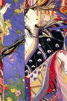
I was in one of my favorite bookstores last night, Forbidden Planet on Broadway and 12th, and I picked up a copy of this incredible book/graphic novel. It is the artwork of Yoshitaka Amano. Beautiful watercolors, with incredible loose linework and spectacular colors. After doing some research, I discovered that he had done character design for a lot of the Final Fantasy games. I love coming across artists that I have never heard of and getting inspired. Some others that I have come across lately are; James Jean and Robert Mackenzie. You can see Robert's work in the new graphic novel compilation "Out of Picture". Eleven short stories by the production artists from Blue Sky (creators of Ice Age and Robots). If you know of artists that knock your socks off, please share!
Stylus or Mouse?
This is a response to Sansceo who asked " Do you use a stylus in Photoshop while painting? I tend to get mouse-hand when doing a lot of detail work."
When I first started painting in Photoshop I used the mouse. I did a number of paintings that way, and yes, my hand would also get sore. I also found that I had no control over the width of my brushstroke unless I changed brushes. About a year ago I bought a 6x8 Wacom tablet, and it has really made the difference. There are a ton of settings that you can adjust (which can also be mind numbing). In the end I am glad I bought it. It was about $350 and has been a steady workhorse. I still use a mouse for all other applications though. I am not a total convert.
Thanks for the question.
Tuesday, August 15, 2006
Wolf! Wolf!-how I paint a cover
Today I wanted to talk a bit about my process for painting. These images are from the cover for my upcoming book "Wolf! Wolf!". It is my version of the boy who cried wolf. Once I have done all the sketches, research and designing, I begin the final art with a very tight drawing that is usually the same size as the finished print. In this case the book is about 9"x11" and because I am doing the front and the back of the jacket as one painting, my final drawing was 10x23 giving a 1/2" extra for bleed. The drawing was done with an hb pencil on strathmore cold press bristol. Then I scan the drawing in (or my publisher does that. They have a much better scanner than me.) Then I start to paint in photoshop. Using layers in photoshop, I multiply the drawing on my painting layers. I wanted this painting to have a bit of an old fashioned feel so using color balance, I tinted the drawing to become more sepia. I also multiplied the layer twice, and with the second layer of drawing at 20% I used a gaussian blur of 4 pixels. This gave the linework a slight bleed which I like. You can see in the detail of the underpainting, that it is fairly simple. I let the drawing do most of the work. I am also more comfortable with a pencil than a paintbrush, even with command z! I was very pleased with the final painting. Then my Art Director, the fabulous Christine Kettner, and I designed out the final jacket. I wanted the title to have a real sumi brush Asian feel, and yet still be very readable. She got Leah Palmer Priess to do the final lettering, and I was really thrilled how it came out. Look for this jacket on bookshelves in March 07 (hopefully facing out!)
Sunday, August 13, 2006
Moonpowder-Layout process
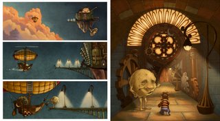
Although all the sketches are not final, I had to plow ahead and do one of the layouts. This is a double page spread, when little Eli Treebuckle arrives at the Moonpowder factory with Mr. Moon. This is done in pencil, and then I will scan it in and paint in photoshop. That allows me the most flexibility when making color choices, and also helps me stay consistent throughout the book. The other image is a quick lighting pass that I do with the layout. This allows me to plan how the final piece will look with all the shadows and lighting in place. I probably will not post the final painting until later in the year, as right now I want to focus on getting the rest of the images figured out. For the front door of the Moonpowder factory, I drew visual inspiration from the train station in Antwerp, and the Celestial Clock in Prague. They are both beautiful pieces of design and I highly recomend seeing them in person if you ever get a chance. On another visual note, when I wrote the first draft of the manuscript, this scene had a long visual description of what was happening and what things looked like. And after I did the layout, I found that I didn't need any of that. Now it just says "Welcome to the Moonpowder Factory" Mr. Moon beamed.
By the way, to all those posting comments. Thank you. I hope that this can become an open forum for discussing the art of children's books. best, John
Wednesday, August 09, 2006
Aahh kids
Friday, August 04, 2006
Sketch process....Percy Cover
As promised, I have posted the sketches that were created for the Percy Jackson cover (see post from July 31st, 2006).
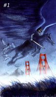
You can see that the Editor, Art director and I went through a number of designs. Sketch one, although I still like it, did not have the ominous feeling that the first two covers had. You can see them on my website http://www.roccoart.com.
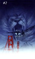
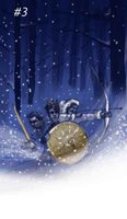
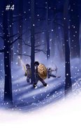
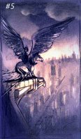
So sketch two incorporated one of the monsters from the book. Although a successful design, the editor felt it was too similar to some of the Narnia imagery. The third sketch shows three of the main characters in a snowy wood. Both the AD and the Editor liked this cover but we wanted to pull back a bit and seperate the kids. That led us to sketch four which we all liked alot. They took this sketch to sales and we were all hopeful, but alas, this book is coming out in spring and the snow was a bit of a turn off. I was starting to lose hope that I would nail this cover like the first two which were exepted after one or two sketches. So the AD and Editor suggested a scene when Percy and his Pegasus are on top of the Chrysler building in Manhattan. I came up with sketch five. Success! The only comments were to make it more blue, less purple and have Percy's face fall more into the shadow. The whole sketch process took a couple of weeks of going back and forth, but I think in the end it was worth it. I will know next week if the final painting is approved by all the powers that be. stay tuned.
Thursday, August 03, 2006
Phantom Isle Book Jacket
Recently, I did this cover for a book called "The Phantom Isle". It is a suspenseful YA novel about three kids who stumble across some books in the library that have ghosts trapped inside them. The Publisher wanted to depict a scene from the book with the three main kids and give it a slightly spooky (but not scary) feel. Once the painting was complete, we wanted to tie in the Polynesian feel, so I created this woodcut-like border. It matched up with the interior black and white woodcuts they already designed and gave them the look they were after. It was a fun project and it had a tight deadline. The challenge for me was reading the manuscript and coming up with the design in three days. In the end both the client (Bloomsbury) and the artist (me) were pleased with the result.
I really enjoy doing these book jackets. They give me an excuse to stop what I am doing and read for a couple days, and in the end I will have another piece of art out there on the book shelves! Not a bad deal.
Thanks Bloomsbury!
Tuesday, August 01, 2006
Moonpowder under way
After quite a few drafts of the manuscript, my second book, Moonpowder, is well under way. Here is a version of the cover that I painted a while back. It really sets the tone for the piece. I am currently working on the book dummy (sketches) for the entire book, and my intention is to give it a slight graphic novel feel. It will be a 32 page picture book published by Hyperion Books for Children. The expected release date is spring 08', which means I will need to complete the paintings by the end of the year. I will post sketches, layouts and paintings as I complete them.
Meanwhile, I will continue to plod along and try not to melt in this NYC heat!
Subscribe to:
Posts (Atom)